Overview
GLI NorCal’s brand is the collection of perceptions people have about our company. It is the big picture impression that is left on our customers and those who interact with us.
GLI NorCal’s branding exists to differentiate our company from others in the marketplace, as well as connect with a target audience. It creates trust and recognition by communicating in a consistent way across all teams and channels.
This style guide is the visual translation of GLI NorCal's mission, vision and values. It is the framework that specifies how to communicate the GLI NorCal brand. The design assets presented within are the tangible visual elements that determine how our brand is perceived by, and how it interacts with, the world.
Brand Story
For over 30 years, GLI NorCal has been a leading provider of exceptional landscape construction services throughout the Bay Area. Our extensive experience spans both residential and commercial projects, making us a trusted name in the industry.
Our Mission
Our goal is to build outdoor spaces that are not only visually stunning but also functional, ensuring that you can enjoy the beauty of your landscape for a lifetime.
Our Vision
Our approach to landscaping is rooted in a deep passion for design and execution. We take pride in our meticulous attention to detail, ensuring that every aspect of a project is handled with care and precision.
Our Values
At the heart of our work is a commitment to excellence, ensuring that each landscape we create reflects the highest standards of craftsmanship and quality.
Logo Identity
GLI NorCal’s logo is the cornerstone of our brand identity. It clearly communicates who we are, our values, is visually appealing, and makes a lasting impression on GLI NorCal’s audience.
The GLI NorCal logotype design and its variations are property of GLI Norcal Landscape Construction. All rights afforded under U.S. copyright law are retained by the owner.
Correct and incorrect versions of our company name include:
Correct:
- GLI NorCal
- GLI Norcal
- GLI NorCal Landscape Construction
Incorrect:
- gli norcal
- GLI norcal
- GLI Nor Cal
Permission Required. Written permission is required by any individual, persons, or company desiring to use our identity graphics in conjunction with a commercial product, business name or unaffiliated service.
Distribution. Do not redistribute without our expressed consent as files are subject to change without notice.
Right of Refusal. The owner retains the right to revoke permission and use of graphic assets for any reason.
Approved Logo Variations
Primary Logo Variations

Secondary Logo Variations




Approved Brandmarks and Wordmarks
Primary Brandmark / Wordmark Variations

Secondary Brandmark / Wordmark Variations




Usage Specifications
How to use our logo assets:
Provide an adequate amount of space around the logo to prevent overcrowding. Horizontal logos are used for website headers and business cards. Brandmarks are used as design elements where necessary.
How not to use our logo assets:
Do not use our logo designs in unapproved colors. Our frog brandmark should never purposely be tilted nor oriented differently from what is shown here.
Color Palette
GLI NorCal’s official palette is comprised of a variety of swatches, each functioning as an essential component to our brand’s web presence and print design materials.
Forest Green
RGB
66 / 107 / 51
HEX
426B33
CMYK
38 / 0 / 52 / 58
Pantone
7743 C
Used as the primary green within our logo design.
Asparagus Green
RGB
105 / 152 / 77
HEX
69984D
CMYK
31 / 0 / 49 / 40
Pantone
7490 C
Used as a secondary accent green within our logo design.
Sunset Orange
RGB
233 / 116 / 36
HEX
E97424
CMYK
0 / 50 / 85 / 9
Pantone
158 C
Used as a tertiary accent color within our logo design.
Soft Black
RGB
37 / 37 / 37
HEX
252525
CMYK
0 / 0 / 0 / 85
Pantone
Black C
Used for body copy and footer background.
Silver
RGB
187 / 187 / 187
HEX
BBBBBB
CMYK
0 / 0 / 0 / 27
Pantone
Cool Gray 4 C
Used for smaller links within the footer.
Alabaster
RGB
235 / 239 / 234
HEX
EBEFEA
CMYK
2 / 0 / 2 / 6
Pantone
9063 C
Used as a background color for selecting individual services.
White
RGB
255 / 255 / 255
HEX
FFFFFF
CMYK
0 / 0 / 0 / 0
Pantone
N/A
Used as the primary background color, navigation, title header/subheader, CTA rows and large footer links.
Typography
Typography -- the visual art of creating written words -- is an essential building block of GLI NorCal’s brand identity. GLI NorCal utilizes the following defined typefaces for all content displayed on our website at https://glinorcal.com.
Primary Typeface: Kaisei Decol
Kaisei Decol is a modern serif typeface with a tall x-height and varying character widths, allowing it to communicate with confidence, elegance, and sophistication. It is welcoming, highly legible at larger sizes, and more ornate than traditional serifs.
H1 heading
H2 heading
H3 heading
H4 heading
A B C D E F G H I J K L M N O P Q R S T U V W X Y Z
a b c d e f g h i j k l m n o p q r s t u v w x y z
0 1 2 3 4 5 6 7 8 9 ! ? . , : ; ‘ “ ^ < >
@ # $ % & * ( ) [ ] { } / \ | _ + = - ~ `
How quickly daft jumping zebras vex.
The quick brown fox jumps over the lazy dog.
This is a paragraph that uses every single letter in the alphabet. Now, that doesn’t mean this can be a paragraph with no story, but it does mean that every single letter is used. You can make it as generic or fanciful as you’d like. You can talk about anything from quilts to jets to xylophones. Oh yeah, and you can use whatever language you want, from Afrikaans to Zulu.
Directions for use:
Kaisei Decol is the serif typeface used for GLI NorCal's logotype identity. It is also used for all standard (non H1) headers including H2, H3 and H4.
View Kaisei Decol at Google Fonts.
Secondary Typeface: Montserrat
Montserrat is a highly legible and modern sans-serif font that pairs well with the beautiful, urban landscape of San Francisco, comprised of renowned architecture set against the Bay. It's the perfect font for a city that continues to reinvent itself with a forward-thinking attitude.
H1 heading
H2 heading
H3 heading
H4 heading
A B C D E F G H I J K L M N O P Q R S T U V W X Y Z
a b c d e f g h i j k l m n o p q r s t u v w x y z
0 1 2 3 4 5 6 7 8 9 ! ? . , : ; ‘ “ ^ < >
@ # $ % & * ( ) [ ] { } / \ | _ + = - ~ `
How quickly daft jumping zebras vex.
The quick brown fox jumps over the lazy dog.
This is a paragraph that uses every single letter in the alphabet. Now, that doesn’t mean this can be a paragraph with no story, but it does mean that every single letter is used. You can make it as generic or fanciful as you’d like. You can talk about anything from quilts to jets to xylophones. Oh yeah, and you can use whatever language you want, from Afrikaans to Zulu.
Directions for use:
Montserrat is used for a variety of purposes including navigation, H1 headers, body copy and footer links. Its various font weights help to provide additional contrast for headers and links displayed at various sizes.
View Montserrat at Google Fonts.
Imagery
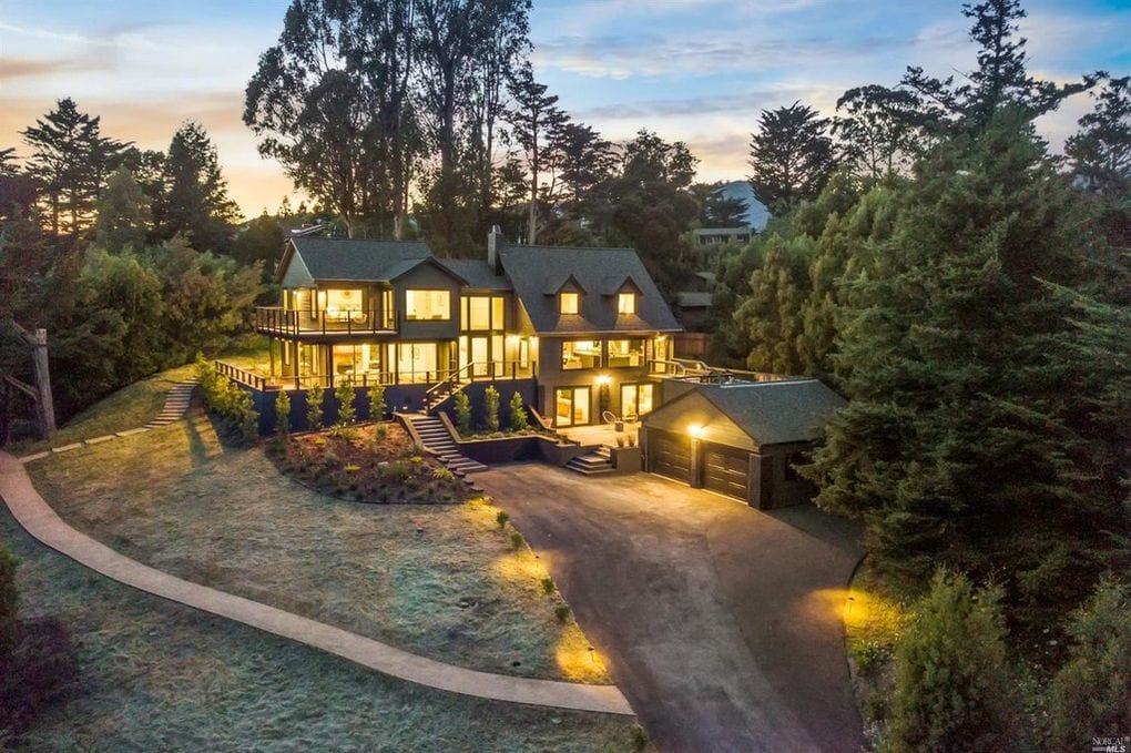
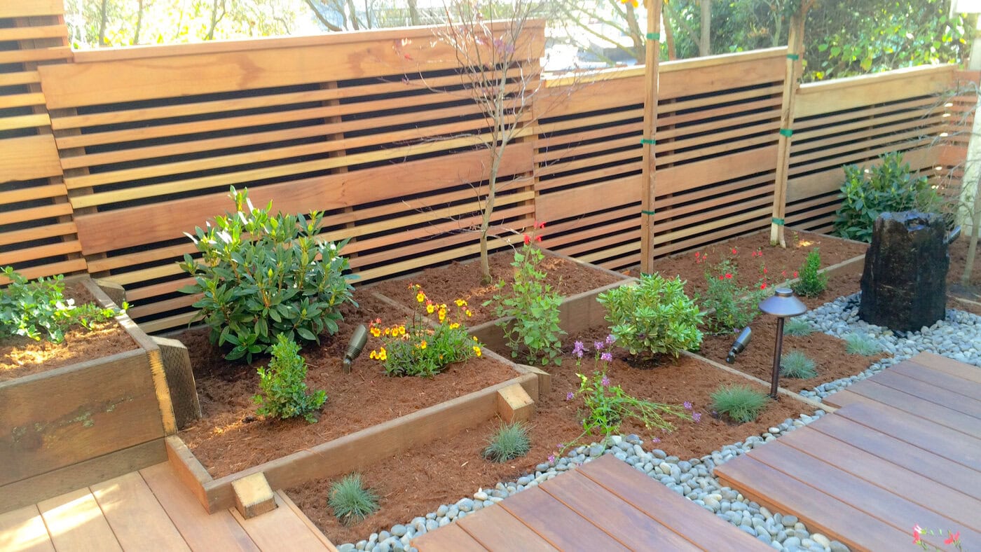
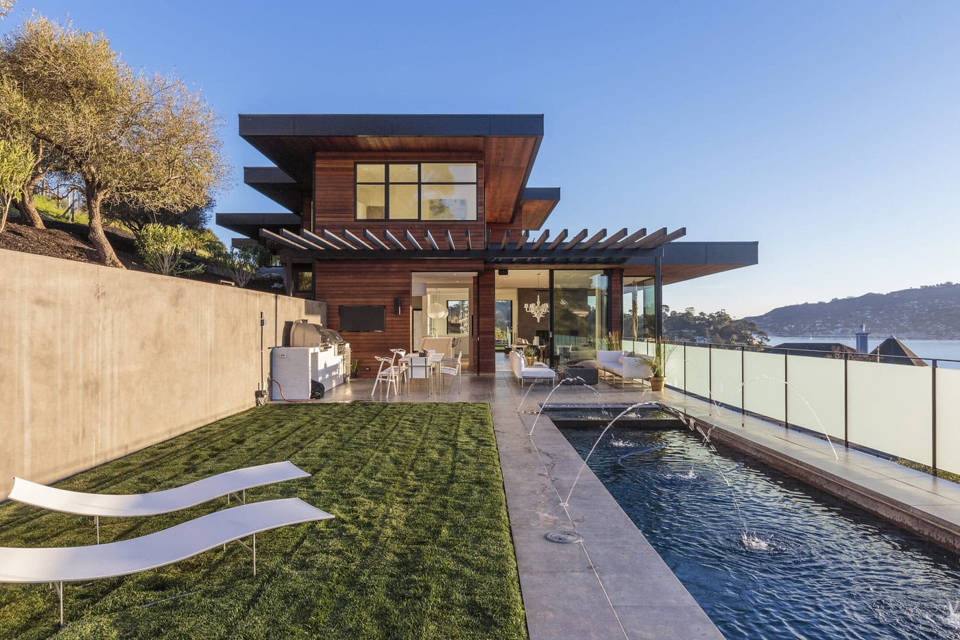
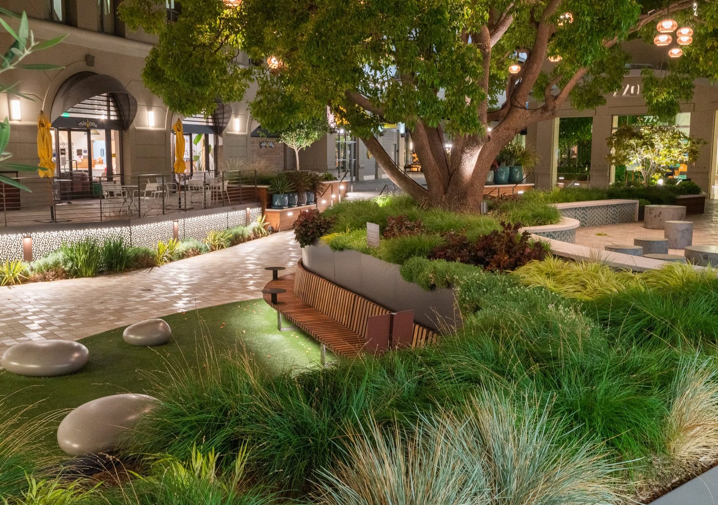
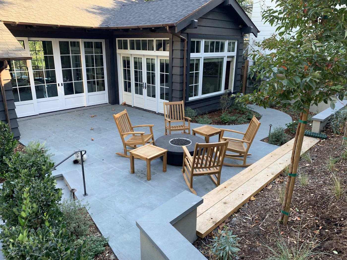
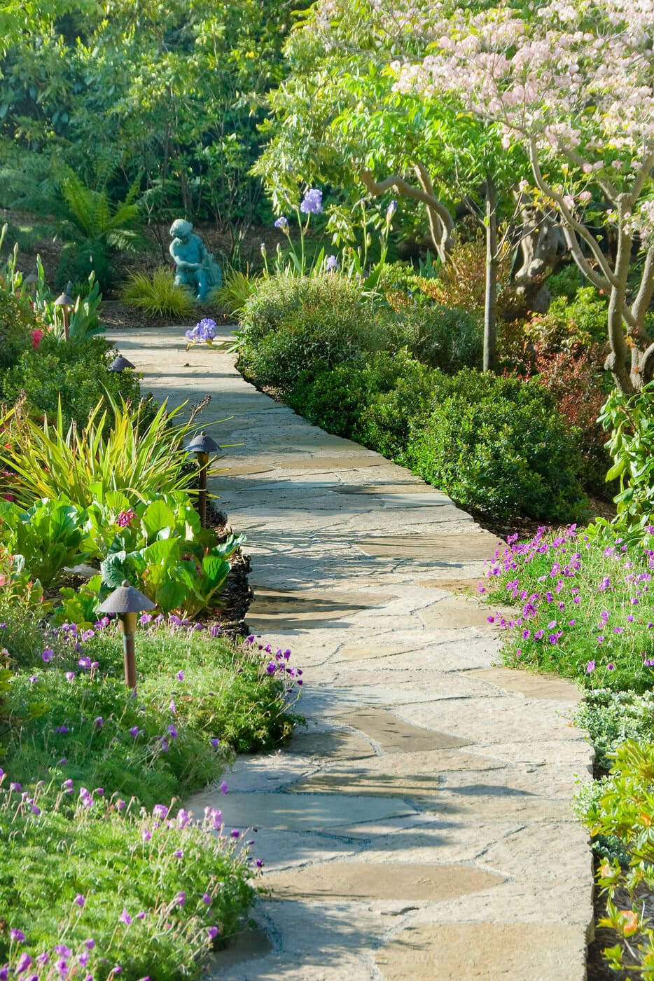
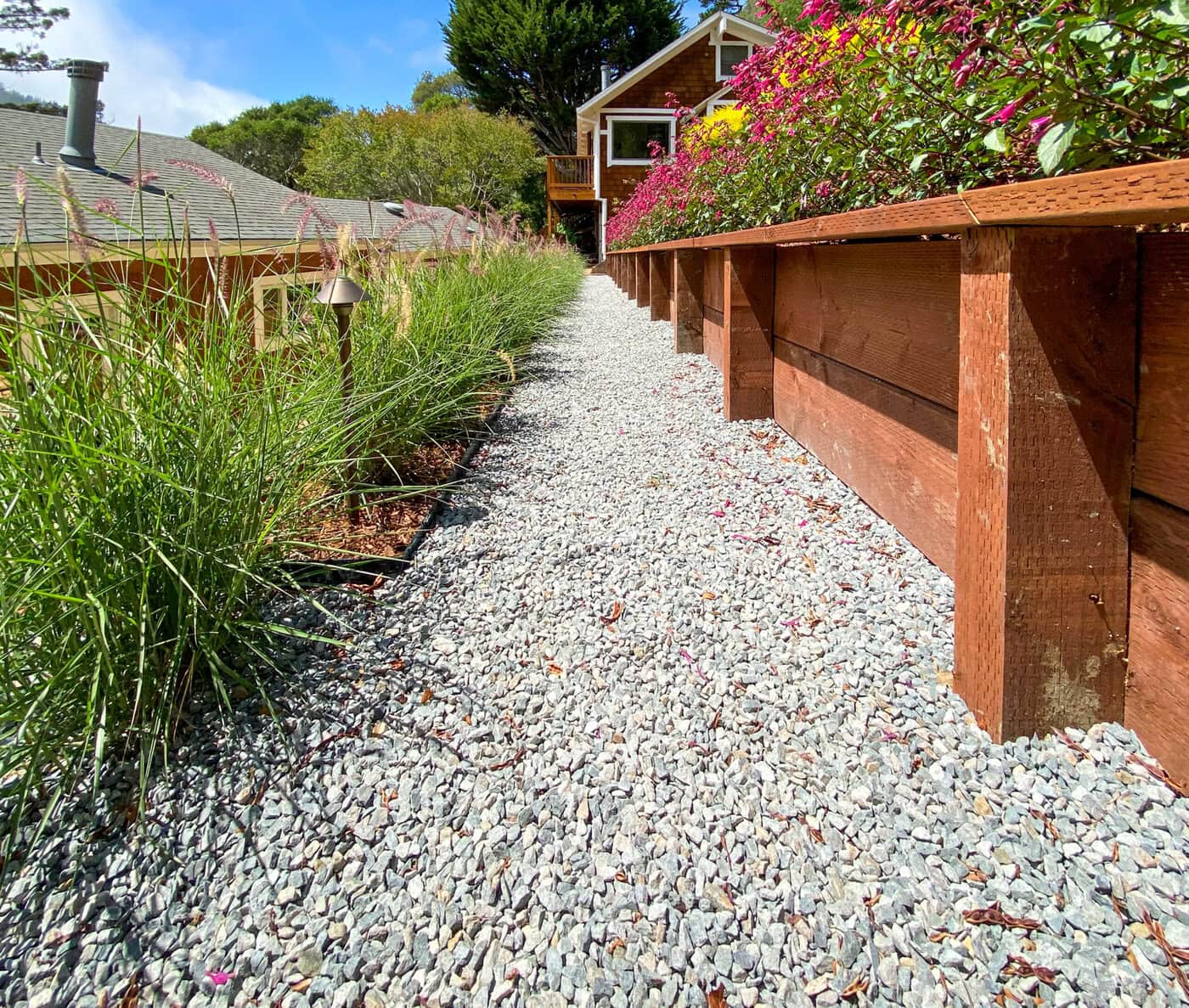
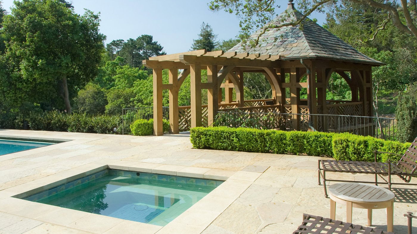
GLI NorCal’s on-brand images help to convey our best practices, aspirations and moods. The following images have been selected to communicate GLI NorCal’s values associated with our brand.
Voice
GLI NorCal’s brand voice strongly impacts how our audience feels about our products and services. The following words and phrases depict our best practices, personality and what does and does not demonstrate the voice of our GLI NorCal brand.
Words we like:
Professional, high-end, residential, landscapes, excellence, care, integrity, teamwork, bespoke, sophisticated, customer service, thoughtful, continual improvement, excellent employment opportunities, meticulousness, modern, organic.
Words we don't like:
Cheap, imprecise, careless, shortcuts, inattentive, unsafe, heedless, commonplace, outdated, quick, negligent, plain.
